
I've had my hands on iOS 4, Apple's latest update to the iPhone's Operating System, for more than a day now. It is a fantastic update with many wonderful enhancements, tweaks, and full-on upgrades that make it worth a look. The biggest of the new features is, of course, multitasking; however, sorry 1st-gen iPhone and iPhone 3G owners: you'll be missing out on multitasking. In fact, I've heard that 1st-gen iPhone owners don't get to take any part in this new upgrade; time to buy a new iPhone, fellas!
Anyway, I'm here to go in-depth in explaining some of the changes and improvements Apple has included this time around, as well opportunities I feel Apple missed out on which keep me from being wholly satisfied with this update.
iOS 4 brings more than 100 new features:

- (see pic at left) Multitasking explained: double-tapping the home button opens the multitasking tray, which currently acts more like a "Most Recently Used Apps" selector; once developers update their apps to support Multitasking, you can seamlessly swap apps without losing any data; if you're playing Tap Tap Revenge and you receive a text message, hit Reply to read and/or respond to that message; after that, double-tap the home button and Tap Tap Revenge will be at the left of the tray; when you tap it, you'll pick up exactly where you left off in whatever song with a 3-2-1-Go! count-in to ease you back into playing. Multitasking fundamentally changes how you can use the device. But remember, multitasking is incompatible with iPhone 3G, 2nd-Gen iPod Touch, or anything older - those devices just aren't strong enough to handle the feature
- (see pic above) Updated Album interface,
 now shows album art/cover and other info
- Edit and Create Playlists on-the-go
- Bluetooth Keyboard Support
- Game Center: Apple's new, free XBOX
LIVE-ish service that no apps support yet
- New app, free: iBooks, w/ PDF support
- New app, $4.99: iMovie; only compatible with iPhone 4 due to its required resources
- iAd, Apple's new mobile advertising network, makes it easier for developers to make more money by simplifying the process of integrating advertisements into their apps
- Camera app now has 5x digital zoom, as
well as tap-to-focus when recording video; select multiple photos for mass deletion, albums and menus support landscape; Rotate and Resize individual photos
- "Rate app?" app deletion dialog removed
- (pic below) Organize apps into Folders, folder name up to 13 characters; 12 apps per folder, maximum 2,160 total apps

- Gift app to friend in App Store
- Screen-lock passcodes now QWERTY keyboard enabled, whilst 4-digit number codes are now a "Simple Passcode" option - Location icon in status bar notifies you when an app is using your current location
- Homescreen background wallpaper
- OS-Wide Dictionary and Spell Check
- Portrait orientation lock
- Notes can now sync with MobileMe, Gmail IMAP, and/or Yahoo! Mail; particularly useful for making lists of groceries or whatever else
- A new birthday Calendar by default
- Stream-lined New Contact screen
- Spotlight now searches Web and Wikipedia
- History suggestions when typing in URL bar
- Recent Global Searches below Search field; if default search engine is Google, these Recent Searches are Google Suggest
- Rotate/Zoom vids in Vertical or Horizontal
- Location icon in status bar notifies you when an app is using your current location- App-specific location settings; unified "Locate Me" icon in Maps (pic at right)
- Larger font options in Settings
- SMS now has Spotlight, so you can look for that one part of that one conversation from that one time... Also, home screen's Spotlight accesses SMS threads for system searches
- SMS Character Count option in Settings
- You'll be alerted of an SMS Send Failure via a pop-up dialogue notification
- Mail has a Unified Inbox and supports multiple Exchange accounts; archive and/or delete Mail search results; organizes emails into threads, like Gmail does; QuickLook attachments, and open attachments based on file types registered to apps from the App Store; SmartLinks for dates and addresses, contact pictures shown in email messages
AND AT LEAST A DOZEN MORE!!!
My Intensive Analysis Of Changes And
In-Depth Overview Of All That's Missing
From Apple's Latest Mobile OS Offering
I. The New OS-Wide iPod Controls
A) In the previous iOS, an available option in the Settings was that when you had music playing, you could double-tap the home button to bring up an iPod control dialog that included a Volume Control slider; Rewind/Previous Track, Play/Pause, and FastForward/Next Track buttons; the name of the song, album, and artist; and of course, buttons to close the control window or visit the iPod application. Also in this window - as I recall - if you had Bluetooth enabled, there was a selector for what output(s) you'd like to be streaming music to.
If music wasn't playing, double-tapping the home button would carry you from whatever you were doing to the iPod App, so that you may get some music going.
1) I really liked these controls. Whenever I would lounge around on my bed with my entire library of more than 22GBs of music on Shuffle, enjoying a nice round of Flight Control, it was simple to check out what exactly I was listening to with a couple clicks.
2) One complaint I never had until now, though, was that I couldn't toggle Repeat and Shuffle options on that little window. Of course, you might think such a thing trivial - but what if I wanted the song I was on to repeat when it finished? I'd have to exit whatever app I was in and toggle that in the iPod, which - in the case of poorly produced apps that don't save what you were doing in case of a phone call, accidental press of the home button, or brief exit to the iPod - was a somewhat annoying hassle.
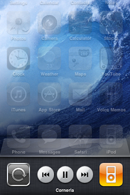
B) In iOS 4, the system-wide iPod controls are now embedded at the furthermost left of the multitasking tray - alongside an Orientation Lock button and the icon of the music app currently playing. You read correctly: if you were listening to Pandora (a highly popular Internet radio service) in the background rather than your iPod - which is now possible in iOS 4 - not only would the icon at the right be that of Pandora, but the control buttons here would also control your Internet radio stream. Same for any other music-streaming app from the store: the icon will be displayed here, and if the app itself is programmed well and takes advantage of these controls, they will work.
Notice, when you open the multitasking tray by double-tapping the home button, the newly beautified dock slides up, along with the rest of the screen's content; also new to iOS 4, custom background wallpaper. And yes, it IS about freakin' time, thank you very much...
"Corneria", the song I was listening to when I took this photo - by holding the Sleep/Wake button and tapping the home button, in case you didn't know - is indeed a theme from the classic Nintendo 64 video game StarFox 64. I wouldn't have to tell you this if it would display the album, artist, and - why not - some artwork.
Room For Improvements:
1) Orientation Lock To Landscape, Landscape Homescreen
a. As of now, you can only lock the OS-wide orientation to Portrait mode. Likely once the homescreen works in Landscape mode, you will be able to lock OS-wide orientation to landscape. But while that might never happen, let's hope it does - I mean, iPad's got it ["others don't", Sonic commercials fer the win...].
2) Those iPod Controls Are A Little Too Simple
a. As I'm listening to music, some tracks - like the example below - might have really long names.

Fiddling through my music to find an example, I come accross this: "Act 1-06: The Flying Ma...me of FINAL FANTASY IV)". If you read that, would you be entirely sure what you were listening to?
My only clues are that I had put [Artist] OCremix.org on shuffle and the phrase "Final Fantasy" - a popular video game saga. By the way, this is Track 6 on Disk 1 of OCremix.org's Final Fantasy 4 remix album:
b. Some tracks, I wouldn't be sure what they're from unless I open iPod to find out.
c. I would really like it if...
+track names that are too long would scroll with a marquee animation: text comes in at the right, flows out at the left; there is extra space after the end of the track's name, and the beginning of the title comes floating back again
+below the track name, alternate between the Artist name and Album name, just like in iTunes (before iTunes 10); if either are too long to display, marquee scroll. Or, as in iTunes 10, display both in one line: "Artist - Album".
+at the edge of the tray, underneath the dock, a Volume slider would be convenient
+show the currently playing track's album art at whatever size somewhere in the void above the dock, with a degree of translucence as not to completely cover the content area
II. Fast App Switching Is Only Fast For Recently Used Apps
A) The previous iOS had no multitasking, so thank goodness Apple's finally come forward with a fair solution - in style.
B) In iOS 4, the multitasking tray - which, in case you forgot, opens with a double-tap of the home button - lists apps by how recently they were used: most recent up front in the left side, least recent way in back, only accessible by swiping and swiping and swiping to the tray's far right. If there's an app back there which you urgently want to switch to, it currently isn't quite "fast app-switching" entirely.
Room For Improvements:
1) Another tray for favorite/bookmarked apps that comes out from the top. That's right...
a. When two trays pop-up - one from the top and one from the bottom - have the app currently in use pinch a tiny bit smaller instead of shoving it off the screen. Have it zoom out to fit between the multitasking trays. Also, this top tray can - perhaps should - look different from the bottom's; maybe make it look like iOS 4's Dock, but upside down.
b. Assuming Apple likes my ideas for the iPod controls in the bottom tray and they implement Volume slider, Shuffle toggle, and Loop toggle down there - but implement it so that the elements which third party apps cannot utilize disappear (Pandora currently don't need no shuffle or loopin' buttons!) - what would the far left of the top tray be used for? Well, why not a Brightness slider... It'd be nice to adjust brightness without having to drag open Settings. OR, this'd be cool: leaving the currently playing song's title in the bottom tray, use the top tray for more intricate info about the currently playing song: stylishly display the song's Artwork next to scrolling info such as Artist, Album, Track Name, and even a Position slider which not only indicates where I am in the song time-wise, but allows me to scrub forward or backward in the song: without ever opening iPod. Front Row, Apple's media center solution included on every modern Mac, has an interface very much like this; it periodically shifts the position of the Artwork and the Info back and forth, swapping them with a fancy flip animation every ten or twenty seconds. Basically, what I'm suggesting is that the far left of the top multitasking tray become that Front Row interface when a song's playing. And as for brightness! When music is not playing... Brightness slider. That means pause with the controls on the bottom tray to adjust brightness in the top tray! Neat, I think.
2) Now what about the empty edges, those empty left and right sides of the zoomed out app-in-use; well, how about this area between the multitasking trays turns into a Cover Flow of backgrounded apps?
a. Flicking left scrolls right, through recently used apps - shown in either a freezeframe of the backgrounded state, or in a live feed of the backgrounded state: what I mean is, if you're in SMS when you pull up multitasking and flick through the Cover Flow to Mail then pause for a moment, your pause indicates to this new and improved multitasking UI that you'd like it to load the app right there, without you having to open it in order to see what it's up to.
b. SMS and Mail the two most recently used apps: send a text message, pop-up multitasking with a doubletap of the homebutton; the now zoomed out SMS app still shows Sending progress, flick right and there's Mail, which then checks your mail, showing you a "Checking For Mail..." status at the bottom; then if you do happen to pull any new emails, this Cover Flow preview will show your last location in Mail's menu with a new message count. That is: if the last time you exited Mail, you were out in Accounts/Inboxes, your Unified Inbox and the Inbox of the account(s) which received a message would show a new email count to alert you; if when you last exited Mail, you were in an Inbox which has just now received at least one message, that message will show up in the Cover Flow preview as if you were using the Mail app - you'll get the New Mail Sound or a vibration buzz depending on your settings, and if you want to check that new message from the boss, tap the Mail Cover Flow preview to do so; or ignore it for later, your call...
c. As of OS 3.0, flicking to the very left of the homescreens landed you at a Spotlight search. In the Cover Flow, what do you think the far left should be? Folders and Spotlight both make finding your apps much easier, so a grid of all your homescreens might not make the most sense. How about a list of most recent notifications?
d. In Google's Android OS - today's runnerup to Apple's mobile device brilliance - the top of the screen is a status bar much like the iPhone's: time, data speed ("bars", signal strength), connections (networks: Edge, 3G, 4G, Wifi), Bluetooth, alarms, etc. are all indicated with tiny icons. Only, in Android, there are two major differences (enhancements, I think): the aforementioned statuses are indicated in the upper right, to the left of the current time. Also, notifications pop-up as same-sized thumbnails in the upper left of Android's status bar; it acts like a windowshade, or deskdrawer - you tap on it and drag down to open your notifications, which include texts, emails, incoming/outgoing/currently-in-progress calls, alarms/reminders/calendar events, and more. When the windowshade is closed - the status bar's up and out of the way as during normal use - and if you have no unchecked notifications, the only icon that might show up in the upper left is one letting you know that you're currently on the phone: in case you were unaware that you were talking to someone as you poked around on your phone, doing stuff. Why do I explain this? Because...
III. iOS needs a better notifications system
A) Notifications are a big deal, especially ever since Push Notifications were introduced with iPhone OS 3.0.
B) In iOS 4, the only notifications that will alert you with pop-up bubbles on the lock-screen when your phone is asleep are still just Texts, Calls, Voicemails, and Events/Reminders. Sure, Push Notifications will also alert you; however - if you've ignored a call, a voicemail, and a text - when a Push Notification alerts you and you ignore it, it won't be there next time you decide to check those notifications out: only Apple's notifications - the calls, voicemails, texts, and event reminders - will still be on the lock screen when you wake up the phone again.
Room For Improvements:
1) From that list of notifications strictly from built-in apps, don't you notice one sorely missing?
a. Emails. We've all read one... But have you ever read one later than you wish you had?
b. Apple's "[Paper] Jet WOOSH" Mail sound effect is cute and all, but Emails seriously need to be a lock-screen notification by now.
c.
Custom Text-tones and Alerts
Audio Visualizer
Home-Screen Widgets, Gadgets
__________________________
I will update this article with more feature requests as I find the time.
nintendude794
Got any ideas of your own for features that iPhones, iPod Touches, and iPads absolutely need? Let us know in the comments!


No comments:
Post a Comment
nintendude794's Youtube Channel
nintendude794's Twitter
nintendude794's DeviantArt Profile